
Mapping America’s Electrification Gap: What the Data Actually Shows
A state-level readiness index from Census, EIA, and NOAA data

Every few months a new report drops claiming some version of “America is ready for electrification.” Heat pumps are cheaper. Incentives are bigger. The grid is getting cleaner.
That’s all true. And it misses most of the story.
Readiness isn’t one thing. It’s the intersection of who is heating with fossil fuels, what they’re paying for electricity, how old their housing stock is, and whether clean power is actually available in their region. When you map all of that together at the state level, the picture is messier and more actionable than any single headline lets on.
So I built it. The Electrification Readiness Map pulls five public data sources into a single state-level index and lets you slice it however you want. Here’s what the data shows.
The Data Stack
Before the findings, a quick look under the hood. Five sources feed the index:
ACS B25117 (Census 5-Year, 2022): Heating fuel by tenure — the core input. Natural gas, LP/bottled gas, fuel oil, electricity, wood, coal. This tells you what share of occupied housing units are fossil-heated.
ACS B19013: Median household income, used to calculate energy cost burden, i.e. an annual estimated energy spend as a share of income.
ACS B25034: Housing vintage (year structure built). Pre-1980 housing has significantly worse thermal envelopes (e.g. higher infiltration, poor insulation, single-pane windows) making electrification retrofits both more necessary and more expensive.
EIA Retail Sales API: State residential electricity rates in ¢/kWh. This is the key economic lever: high fossil share plus high electricity rates means heat pump economics are genuinely competitive right now.
NOAA 30-Year Climate Normals: Heating degree days by state. Cold climates need bigger, better equipment ; but they also have the most to gain from efficient heat pumps compared to resistance heat or older gas systems.
From those inputs, the app computes five derived metrics: energy burden, heat pump ROI score, retrofit difficulty, renewable opportunity, and an overall priority score. All of it is open source.
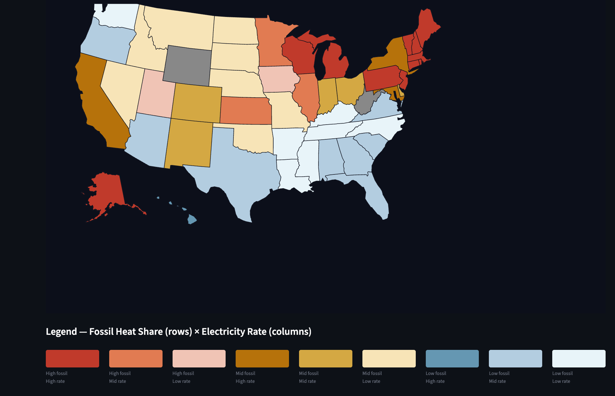
What the Bivariate Map Reveals
The most useful view is the bivariate choropleth map with states colored by the intersection of fossil heat share and electricity rate. Nine classes, from “Low fossil / Low rate” (light blue, easy to stay electric) to “High fossil / High rate” (deep red, maximum switching incentive).
A few things stand out immediately.
The Northeast is a paradox. Maine, Vermont, New Hampshire, and Massachusetts have among the highest fossil heat shares in the country where oil and propane dominate because natural gas pipelines never fully reached rural New England. They also have some of the highest electricity rates in the US. That combination lands them squarely in “High fossil / High rate” territory, which sounds like bad news for consumers but is actually the strongest economic case for heat pump adoption anywhere in the country. The fuel oil they’re displacing costs more per BTU than almost any other heating source.
The Great Plains are a missed opportunity. Iowa, Kansas, South Dakota, and North Dakota have extraordinary renewable capacity factors with wind-heavy grids with capacity factors pushing 40–45%. But their fossil heat shares are also high (natural gas is dominant) and electricity rates are relatively low. That lands them in “High fossil / Low rate” — lower immediate consumer incentive to switch, but an excellent case for grid-scale electrification investment. The infrastructure is there. The policy and consumer economics just haven’t caught up.
The South is heterogeneous. Florida, Georgia, and the Carolinas have moderate fossil shares and moderate rates. But Mississippi and Alabama show up with low median incomes and non-trivial energy burden percentages — a reminder that the affordability lens matters as much as the technology lens.
Energy Burden: The Equity Signal
The energy burden metric, an estimated annual energy cost as a percentage of median household income, is where the map gets uncomfortable.
Nationally, the average energy burden for low-income households is roughly 8–10%. But in some states, the combination of high fossil heating costs, older housing stock, and below-median incomes pushes that burden well above what the federal 6% “high burden” threshold defines as problematic.
West Virginia, Mississippi, Louisiana, and Kentucky consistently appear in the top tier for energy burden. Not coincidentally, West Virginia, Kentucky, and several of those same states qualify as IRA Energy Communities, areas with coal plant or mine closures that earn an additional 10 percentage point investment tax credit adder on clean energy installations under the Inflation Reduction Act.
That IRA adder is significant. For a $15,000 heat pump installation, the difference between a 30% and 40% credit is $1,500 in additional federal support. In states where the economics are already marginal, that can tip a project from unaffordable to feasible.
Retrofit Difficulty: The Hidden Constraint
ROI scores and incentives only matter if the retrofits are physically viable. That’s where housing vintage becomes critical.
The retrofit difficulty index weights pre-1980 housing share (50%) and heating degree days (50%). Old houses in cold climates score highest and the map’s top tier clusters predictably in New England, the upper Midwest, and Appalachia.
Maine scores highest on retrofit difficulty in the country. Nearly 60% of its housing stock predates 1980, and it faces over 7,500 heating degree days per year. Doing a heat pump retrofit in a leaky 1960s farmhouse in northern Maine is a fundamentally different engineering and cost proposition than swapping a gas furnace in a 2005 suburban house in North Carolina.
This matters for program design. Weatherization has to come before or alongside electrification in these markets to include: insulation, air sealing, window upgrades. Otherwise heat pump performance disappoints, bills don’t drop, and the backlash undermines adoption broadly. The Weatherization Assistance Program and the IRA’s home efficiency rebates (HOMES and HEEHRA) are the right policy instruments, but uptake has been uneven and slow.
Heat Pump ROI: Where the Math Works Right Now
The heat pump ROI score weights fossil share (40%), electricity rate (35%), and heating degree days (25%). This is a simplified proxy for the payback calculation a homeowner would actually run; i.e. how much am I spending on fossil fuel heat, what would I pay to run a heat pump instead, and does it pencil out?
The states scoring highest on this metric right now: Maine, Vermont, New Hampshire, Massachusetts, Connecticut , the entire Northeast oil corridor, plus Hawaii (high electricity rates, small fossil base, but the marginal user switching from oil is paying a brutal premium).
Notably, many high-HDD Midwest states score lower than you’d expect because their electricity rates are below average. That doesn’t mean heat pumps are a bad fit there. In fact, cold-climate heat pumps have improved dramatically, and the long-run grid economics favor electrification as renewable penetration grows. But consumer payback periods are longer today than in the Northeast, which has implications for where private capital flows without subsidy.
The IRA Energy Community Overlay
The 15 states flagged as IRA Energy Community states in this index , including: West Virginia, Kentucky, Wyoming, Montana, North Dakota, Illinois, Ohio, Pennsylvania, Virginia, Alabama, Tennessee, Colorado, New Mexico, Utah, and Indiana, represent a specific policy bet: that the communities most disrupted by fossil fuel decline should be prioritized for clean energy investment.
The data supports this targeting. Those states collectively account for a disproportionate share of fossil-heated housing units, above-average energy burdens, and significant retrofit difficulty in the older industrial portions of Appalachia and the Midwest coal belt.
The challenge is that the IRA adder primarily benefits commercial and utility-scale projects, not individual homeowners. The residential credit enhancements (25C, 25D) are separate. Bridging that gap and making sure the communities that qualify for the energy community adder actually see residential electrification investment requires state-level program design, community development financial institutions, and workforce development that federal credits alone don’t guarantee.
What I’m Watching
A few things I’ll be tracking as I update this dataset:
Rate trajectory. Electricity rates are rising in most states as grid infrastructure investment accelerates. That changes the ROI calculus. It is faster in states like California and New England where rates are already high and more slow in low-cost Midwest markets. If rates converge upward while fossil fuel prices remain volatile, the priority map shifts significantly.
Cold-climate heat pump performance data. The 2022–2023 winter performance data from NEEP and PNNL showed cold-climate heat pumps operating effectively down to -15°F. As that data filters into consumer awareness and contractor training, the HDD penalty in the ROI model should shrink.
IRA implementation pace. The gap between IRA authorization and actual residential rebate availability has been wide in many states. When HEEHRA rebates fully deploy, the effective cost of a heat pump retrofit drops 30–50% in lower-income households. That will move the burden maps meaningfully.
The tool is live and the code is open source. If you want to dig into a specific state, run the fossil share filter, toggle the IRA communities overlay, and check the Retrofit Difficulty tab, the state-level scatter plots give you a clearer picture than any aggregate number.
The Electrification Readiness Map is built on ACS 5-Year 2022 estimates, EIA retail sales data, NOAA 30-year climate normals, and DOE IRA community designations. All data is publicly available. Code on GitHub.
What state surprised you most? Drop it in the comments!